
Victorian Polychromy and Visual Datums: Inspiration Behind Datum House
- Alex Bilton
- Oct 17, 2025
- 3 min read


Victorian architecture’s disciplined use of polychromy—contrasting brickwork, stone banding, and material variation—established clear horizontal datums and a readable facade order across London’s terraces. These ideas continue to inform contemporary work, notably at Datum House in Hither Green, where banding, proportion, and material restraint create a calm, legible addition.
“Contrasting brickwork and stone banding establish clear horizontal datums that organise the facade.”
Why Victorian Polychromy Still Matters
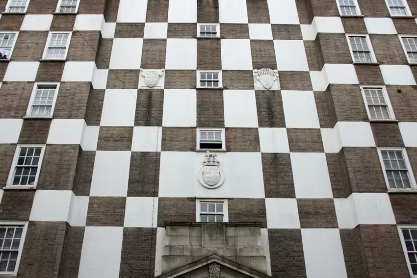
Victorian polychromy uses red brick against lighter stone or pale brick to mark key lines: floor levels, lintels, and eaves. String courses and banding break up tall, narrow elevations and relate architecture to human scale. The method draws from medieval precedent and geological stratification, where layered materials read as time and structure.
Horizontal emphasis balances the verticality of terrace plots.
Bands articulate levels and transitions without applied ornament.
Material contrast provides rhythm and hierarchy street-wide.
Across the 20th century, architects including Sir Edwin Lutyens reinterpreted Victorian polychromy into disciplined, civic compositions—tempering colour, brick fields, and stone banding to suit new programmes and construction. The approach modernises across eras while preserving clear visual datums and a readable facade order.
Datum House: A Contemporary Translation
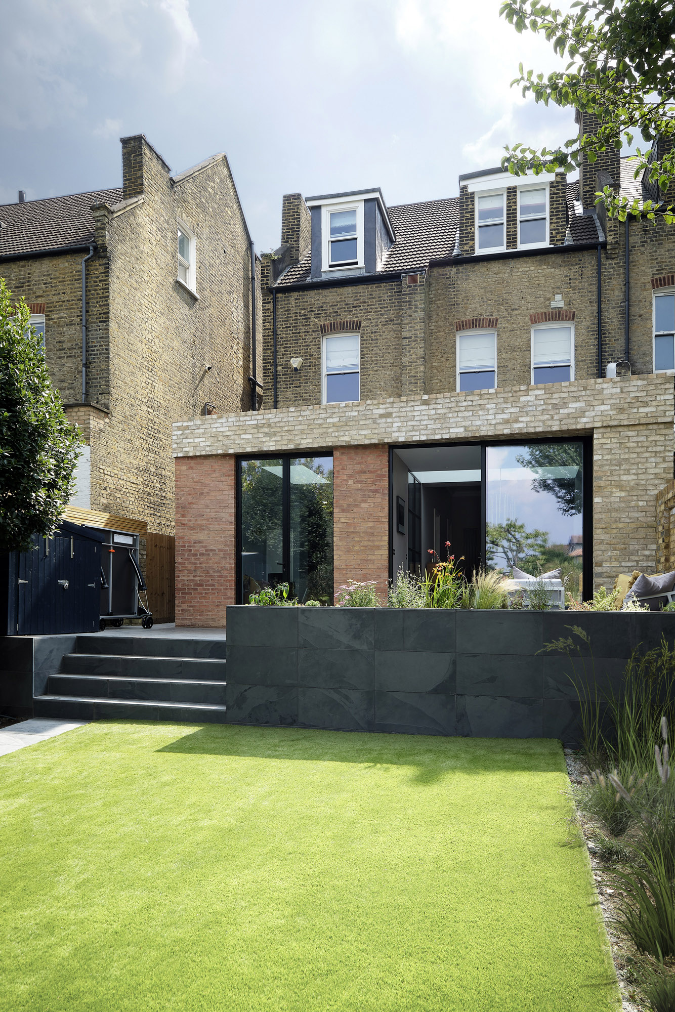
At Datum House, the project introduces a gable-end, pitched-roof structure at the rear, expressed with horizontal brick banding and crisp render. Rather than imitate Victorian ornament, the design abstracts the underlying logic: establish “visual datums” that order the facade and reveal internal arrangement.
A restrained palette of brick and render maintains clarity.
Horizontal banding aligns with internal floor levels and thresholds.
Openings sit within the datum framework to maintain proportion.
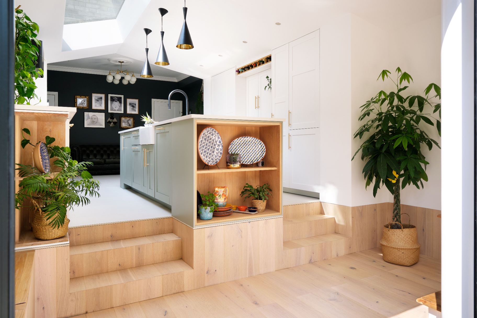
Inside, these exterior datums continue as practical reference lines. Window head heights align with ceiling bulkheads; brick band levels translate into shadow gaps, shelf runs, and worktop heights; and door heads and cills register as consistent thresholds across rooms. The result is a calm interior order in which circulation, joinery, and lighting follow the same horizontal cues.
Banding, Materials, and Weathering
Brickwork variation—a shift in coursing and joint expression—creates fine shadow lines that read strongly in changing light. The bands give the extension scale and depth while avoiding pastiche. They also accommodate practical detailing that improves durability.
What the horizontal brick banding does:
Marks key internal levels for exterior legibility.
Ties new work into the terrace’s established lintel and sill lines.
Breaks up the overall massing to avoid a monolithic read.
Provides weathering ledges and tolerance for material movement.
Frames window and door openings for a consistent elevation logic.
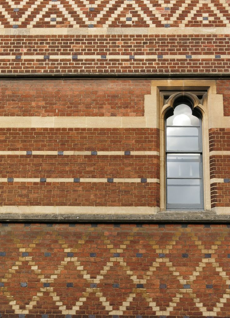
Material selection anticipates patination. Over time, bricks and mortar develop subtle tonal shifts, echoing geological layering. The facade gains texture and depth as it weathers, reinforcing the project’s quiet character and long-term coherence.
Reading the Plan from the Facade
Datum lines correspond to spatial transitions. Bands step across the elevation at points where floors change or where openings edit the envelope. This makes the plan partly “readable” from outside while preserving privacy.
Windows align to datums to maintain a stable cornice-to-sill proportion.
Door heads meet banding to signal thresholds.
The pitched form sits neatly under existing eaves to respect the terrace profile.
ABHR_A’s Leopold Road applies the same principles, using polychromatic brickwork and light-toned banding to mark thresholds and floor levels while maintaining a measured, contemporary elevation.
“Horizontal datums create a calm framework in which individual elements—windows, doors, downpipes—can vary without losing order.”
Context, Continuity, and Streetscape
In a Hither Green setting of tall, narrow houses, horizontal devices counter vertical thrust and stitch old and new. The extension acknowledges existing cornice lines and string courses, balancing continuity with a clearly contemporary expression. The result is contextual—not imitative—architecture that reads as part of the same family of forms.
Lessons for Practice
Datum House shows how historical techniques remain useful when stripped back to first principles.
Work with proportion and level lines rather than applied decoration.
Use material contrast to create legibility and scale.
Let facades explain internal organisation while staying discreet.
Detail bands to manage weathering and movement over time.
This approach demonstrates how a simple, well-placed set of horizontal cues can organise a facade, anchor a new volume to its context, and deliver a robust, low-ornament architecture that ages well. By balancing Victorian precedent with contemporary detailing, Datum House reads as both respectful and clearly of its time.